Your home deserves a space that feels both stylish and functional. Modern design blends Scandinavian simplicity with Japanese intentionality, creating a look that’s clean yet inviting. Leading experts like Katie Harbison and Susana Simonpietri are redefining this aesthetic with warm textures and thoughtful details.
Gone are the days of cold, stark spaces. Today’s approach focuses on balance—think natural light, multi-functional furniture, and smart storage. Brands like West Elm and Chango & Co. prove that less can truly be more without sacrificing comfort.
This guide offers 15 actionable ideas to transform your space. From cozy accents to hidden organizers, each tip maintains visual harmony while boosting relaxation. Ready to create your serene retreat? Let’s begin.
Why Minimalist Design? Less Clutter, More Calm
Less isn’t just about aesthetics; it’s a lifestyle shift that fosters clarity and ease. By prioritizing simplicity, you create a sanctuary where every element has intent—whether it’s a handcrafted ceramic vase or a streamlined sofa.
The Roots of Minimalism: Bauhaus to Japanese Influence
The Bauhaus movement of the 1920s celebrated raw materials—think steel, glass, and concrete—to highlight form. In contrast, Japanese philosophy values restraint, using natural woods and open space to evoke tranquility. Brands like Muji embody this with modular furniture that blends seamlessly into daily life.
Today’s minimalist design merges these philosophies. Chango & Co.’s curved sofas, for example, maximize functionality without sacrificing warmth. As designer Susana Simonpietri notes, “Textured linens and organic shapes create an airy feeling, even in compact areas.”
How Minimalism Enhances Daily Living
Studies show decluttered spaces reduce stress by up to 40%. Katie Harbison’s approach—placing objects with intention—ensures harmony between utility and beauty. Start small: swap bulky furniture for CB2’s Laszlo Apartment Sofa, a transitional piece with hidden storage.
Sheer curtains amplify natural light, while earthy tones ground the room. The result? A home that feels open, purposeful, and effortlessly serene.
Minimalist Living Room Inspiration: Where to Start
Light and space become your greatest design tools. With 78% of designers noting increased requests for warm minimalism, this approach balances simplicity with livability. Begin by assessing your room’s proportions—consider ceiling height, window placement, and traffic flow.
Defining Your “Less Is More” Philosophy
Create a personal manifesto using Pinterest mood boards. Pin images that share common elements—neutral palettes, clean lines, or textured accents. The “3-item rule” helps maintain surfaces: limit decor to a plant, art piece, and functional item like Maiden Home’s oval coffee table.
Frama’s Symmetry Lounge Chair demonstrates intentionality. Its angled frame serves as both seating and sculpture. As designer Athena Calderone advises, “Edit ruthlessly—if it doesn’t serve purpose or joy, it doesn’t belong.”
Key Elements: Space, Light, and Intentionality
Natural light can make areas feel 40% larger. Hang Soho Home’s Maris pendant near windows to amplify brightness. For spatial planning, Serena & Lily’s Harrison Vanity Chair works double duty as seating and storage.
Compare these layout approaches:
| Open Layout | Zoned Layout |
|---|---|
| Uses rugs to define areas | Relies on furniture grouping |
| Best for natural light flow | Creates intimate conversation nooks |
| Ideal for studio apartments | Works in larger rooms |
Implement the “5-minute tidy” system: store remote controls in woven baskets, fold throws neatly. This maintains your sanctuary without daily deep cleans.
1. Embrace a Neutral Color Palette
A neutral palette transforms your space into a calming retreat. Think beige, ivory, and alabaster—these tones create harmony without overwhelming the senses. The key is balance: too much white can feel sterile, while layered creams add warmth.
Best Tones for Serenity
Parachute’s Brushed Cotton Bundle ($628) shows how tonal layering works. Pair ivory throws with beige pillows for depth. Jenni Kayne’s Malibu Side Table proves warm neutrals feel inviting, not flat.
Layering Without Sterility
Follow the 60-30-10 rule: 60% dominant color (walls), 30% secondary (furniture), 10% accent (decor). Brooklinen’s Organic Cotton Duvet demonstrates subtle variations—opt for warm whites over cool.
Avoid “hospital white” by adding texture. Venetian plaster walls or Zara Home’s Mini Ash Stool break monotony. Matte finishes work best in small spaces; glossy reflects light in larger rooms.
Mud Australia’s Porcelain Dinner Set shows how to style neutrals. Mix materials like linen and wood for tactile contrast. The result? A space that’s serene yet full of character.
2. Let Natural Light Take Center Stage
Sunlight transforms any space into a brighter, more inviting retreat. Proper placement of furniture and window treatments can double its impact. Magdalena Keck’s Amagansett project proves even north-facing rooms can glow with strategic design.
Arranging Furniture for Optimal Sunlight
South-facing rooms need different planning than east-facing ones. Keep sofas perpendicular to windows to avoid glare on screens. Gubi’s FA 33 Wall Mirror ($1,499) works best when angled to bounce light toward seating areas.
Follow these placement rules:
- Reading nooks: Within 3 feet of north windows
- Dining areas: Centered under skylights
- Workspaces: Parallel to east windows for morning light
Window Treatments That Enhance Brightness
Sheer linen curtains filter light beautifully while providing privacy. The Inside’s Solar Screen options block UV rays without darkening the room. For sliding glass doors, consider top-down cellular shades.
Compare popular treatments:
| Treatment | Light % Filtered | Best For |
|---|---|---|
| Sheer Belgian Linen | 40% | Living areas |
| Solar Screen | 70% | Home offices |
| Roman Shades | 60% | Bedrooms |
Add Pirout 01 Ceramic Vase near windows to scatter light patterns. Weekly glass cleaning with vinegar solution maintains 95% brightness transmission. Smart blinds like Lutron Serena can auto-adjust throughout the day.
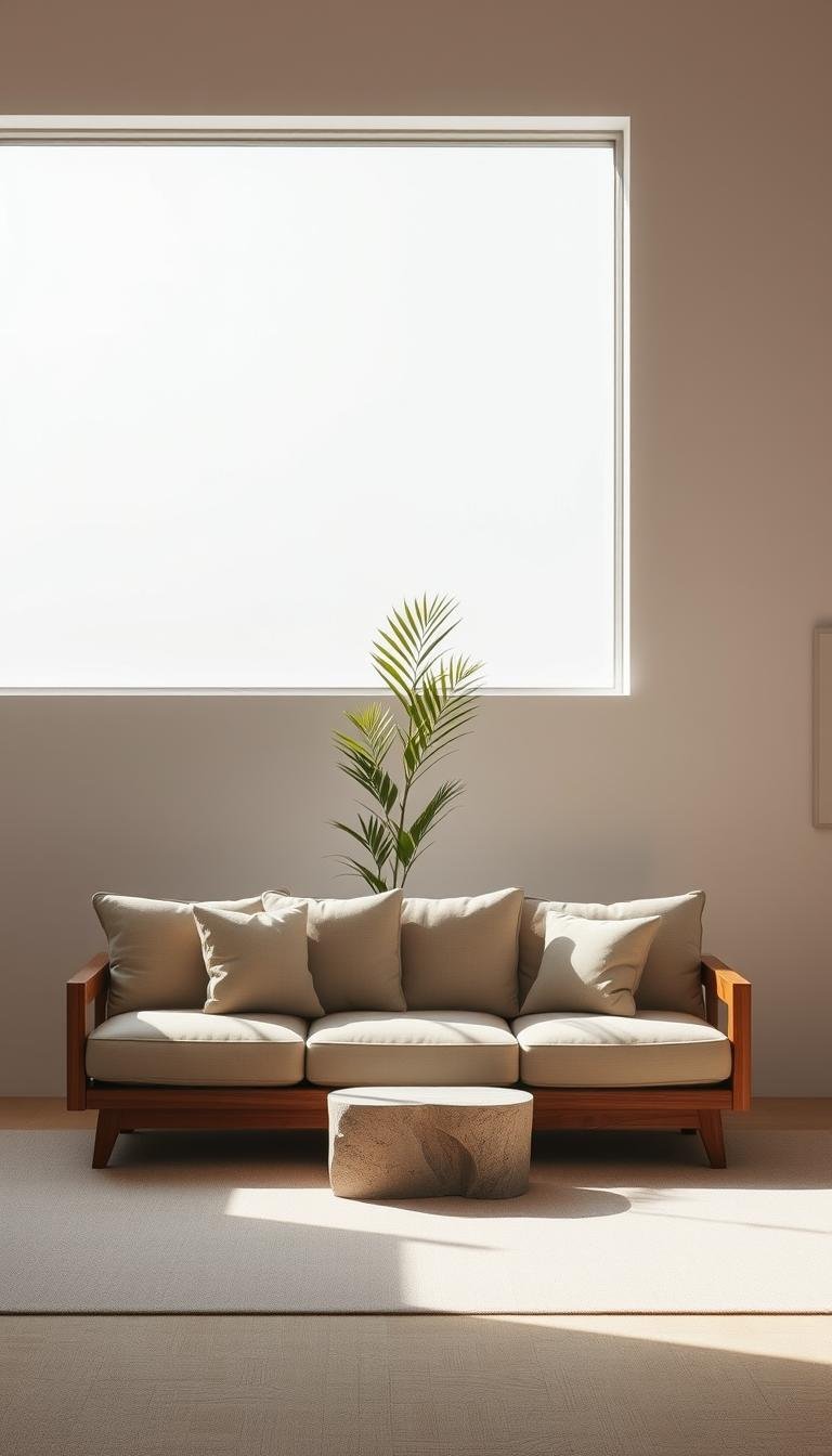
3. Choose Furniture with Clean Lines
Clean-lined furniture creates visual harmony while maximizing functionality. The right pieces anchor your space without clutter, blending form and purpose. Brands like CB2 and Ethnicraft prove simplicity doesn’t mean sacrificing comfort.
Low-Profile Sofas and Modular Designs
CB2’s Laszlo Sofa ($1,999) exemplifies this—its slim arms and hidden storage work in studios or open layouts. For flexibility, consider these modular systems:
- Lovesac Sactional: Machine-washable covers and rearrangeable sections
- Floyd The Sofa: Flat-pack design with eco-friendly materials
- Burrow Nomad: USB charging and adjustable armrests
Low-profile seating improves sightlines in small spaces. Look for seat heights under 20″ and tapered legs, like Menu’s CS Table, to maintain airiness.
Balancing Straight Edges with Organic Curves
Chango & Co.’s Hamptons project masterfully mixes angular sofas with round coffee tables. Ethnicraft’s Aero Bench bridges both styles—its oak frame has crisp lines but warm, rounded edges.
Compare design philosophies:
| European | Asian |
|---|---|
| Steel/glass materials | Natural wood finishes |
| Geometric precision | Asymmetrical balance |
Tip: Use 3D apps like Planner 5D to test layouts. Avoid modular sets with weak connectors—test for “slippage” by gently shaking display models.
4. Warm Minimalism: Texture Over Starkness
The secret to inviting minimalism lies in tactile contrasts and organic warmth. Unlike cold, austere spaces, this approach uses layered texture to create comfort without clutter. Think linen drapes brushing against reclaimed wood, or mohair throws softening angular furniture.

Incorporating Linen, Mohair, and Wood
Start with a tactile sample board using Material Bank swatches. Compare linen blends—Parachute’s heavyweight option resists pilling, while Cultiver’s offers superior drape. The Wren’s Arbor Moss Blanket ($810) demonstrates how chunky knits add organic texture.
Frama’s oak finishes prove wood materials can feel modern yet warm. Pair their Taro Floor Lamp with Crate & Barrel’s Paolo Chair—its ribbed velvet plays against smooth walnut legs. For upholstery, Ferm Living’s Bouclé Armchair shows how looped wool softens clean lines.
Maintenance matters with natural fibers:
- Vacuum mohair weekly with brush attachment
- Spot-clean linen with mild soap and cold water
- Treat wood with beeswax polish every 6 months
Earthy Paint Colors for Cozy Minimalism
Clay plaster walls create depth that flat paint can’t match. Try Portola Paints’ Roman Clay in “Gris” for subtle variation. In small spaces, limit textural elements to avoid visual noise—one statement wall often suffices.
Compare these warm neutrals for different effects:
| Paint Name | Undertone | Best For |
|---|---|---|
| Benjamin Moore White Dove | Yellow | North-facing rooms |
| Farrow & Ball School House White | Pink | Small spaces |
| Sherwin-Williams Alabaster | Beige | Open floor plans |
Layer rugs over heated floors for winter coziness—try a jute base with sheepskin accents. Remember: true minimalism isn’t about lack, but about choosing every element with care.
5. The Art of Tonal Accents
Tonal accents create depth without overwhelming your space. Studio Dorion’s Brooklyn Heights showhouse demonstrates this perfectly—layered beiges and ivories make the area feel expansive yet intimate. The key lies in subtle variations within a single color family.
Monochromatic Artwork and Upholstery
Agnes Martin’s $2,500 abstract pieces prove how single-color art commands attention. Hang similar works against matte walls for gallery-like impact. For fabrics, compare these textures:
- Wool rugs: Natural variations in dye absorb light softly
- Polyester blends: Uniform coloring works for high-traffic areas
- Linen upholstery: Fades beautifully into tonal schemes
1stDibs’ curated collection shows how to mix eras—pair a 1970s ochre vase with modern taupe chairs. Keep metal finishes consistent; brass works with warm tones, while nickel complements cool grays.
Extending Color Schemes to Flooring
Karastan’s wool carpets demonstrate seamless transitions. Choose options 1-2 shades darker than walls to ground the space. For wood floors, consider these approaches:
| Option | Effect | Best With |
|---|---|---|
| Stained oak | Adds warmth | Cool wall colors |
| Painted gray | Modernizes | Warm neutrals |
| Whitewashed | Brightens | Small spaces |
Create flow between rooms using gradient painting techniques. Start with your darkest shade at the baseboard, lightening upward. Avoid “muddy” mixes—test swatches at different times of day before committing.
6. Functional Decor: Less Items, Higher Impact
Every piece in your space should serve a purpose—function meets beauty in intentional design. The right accents elevate without overcrowding, blending artistry with daily utility. Soho Home’s Maris Pendant ($452) exemplifies this, doubling as a sculptural centerpiece and task light.
Pendant Lights as Sculptural Statements
Lighting becomes art when form follows function. Compare these statement brands:
| Brand | Signature Piece | Best For |
|---|---|---|
| Flos | IC T1 Pendant ($1,200) | High-ceilinged rooms |
| Menu | JWDA Concrete Lamp ($399) | Industrial accents |
| Gantri | Orb Pendant ($248) | Small-space glow |
Choose 2700K-3000K bulbs for warmth. Pair with Menu’s Afteroom Stool—its matte finish complements metallic pieces.
Plants and Ceramics for Subtle Personality
The Sill’s Black Olive Tree ($499) adds organic shape, while Joanna Ling’s hand-thrown vases introduce texture. Follow Horti’s styling guides:
- Air-purifying picks: Snake plants, ZZ plants
- Glazed vs. unglazed ceramics: Glossy for drama, matte for calm
- Seasonal rotation: Swap eucalyptus for pampas grass in fall
Pro tip: Limit decor to 3-5 intentional pieces per surface. Over-accessorizing disrupts visual flow.
7. Wood Slat Panels for Subtle Drama
Vertical wood slats create visual interest while maintaining openness. These design elements add rhythm to your wall without sacrificing airiness. Room & Board’s 2024 collection proves slat dividers are both functional and sculptural.
Room Dividers That Don’t Overwhelm
Slat partitions offer 30% better sound diffusion than solid walls, per acoustic studies. For balance, use a 1:3 spacing ratio—1-inch gaps between 3-inch slats. Dinesen’s oak panels (from $200/sq ft) showcase natural grain variations.
Child-safe spacing? Keep gaps under 4 inches. Integrate LED strip lighting between slats for evening ambiance. “Slats cast delicate shadows that change with daylight,” notes designer Kelly Wearstler.
Pairing Slats with Mid-Century Furniture
Mid-century design pairs seamlessly with slat walls. Carl Hansen’s CH88 Chair ($2,495) complements the linear look with its teak frame. Compare wood species for different effects:
| Wood Type | Best For |
|---|---|
| Walnut | Warm, high-contrast interiors |
| Ash | Light, Scandinavian-style spaces |
| Reclaimed Pine | Rustic or industrial settings |
DIY tip: Use pre-cut poplar slats ($1.50/linear foot) for budget-friendly projects. Anchor panels 12 inches from the ceiling to preserve space perception. Avoid overusing slats—limit them to one focal wall per room.
8. Black-and-White Contrast Done Right
Your space gains instant drama with well-executed tonal opposition. Studies show high contrast environments boost focus by 22%, making this scheme ideal for creative zones. The trick lies in balancing boldness with restraint—too much polarity feels harsh, while subtle gradations create depth.
Bold Coffee Tables Against White Sectionals
Maiden Home’s Emile coffee table ($2,950) demonstrates perfect scale. Its matte black surface plays against light upholstery without overwhelming. Follow these placement rules:
- Small rooms: 24″-diameter tables prevent visual heaviness
- Open layouts: Oval shapes soften angular furniture
- Sectionals: Match table length to 2/3 of sofa span
Gubi’s Bestlite BL5 adds metallic pop as a side accent. Its polished brass finish reflects light between dark and light zones.
When to Break the Monochrome Rule
Leanne Ford’s crimson accent chair proves strategic color interruptions prevent sterility. Use this checklist:
| Element | Recommended Break | Frequency |
|---|---|---|
| Glassware | Amber or cobalt pieces | 1 set per room |
| Artwork | Single warm-toned abstract | 1 large piece |
| Textiles | Ochre throw pillows | 2 max per seating area |
Maintain a 3:1 white-to-black ratio for harmony. Avoid striped rugs—they compete with slatted design elements. Instead, try solid dhurries with textured weave patterns.
9. Prioritize Thoughtful Material Finishes
Material choices define the soul of your space, blending durability with quiet elegance. Whether it’s the hand-troweled swirls of plaster or the glaze on a ceramic vase, these finishes create tactile experiences that outlast trends.
Plaster Walls and Handcrafted Ceramics
Venetian plaster costs 3x more than drywall but develops richer character over decades. Applied in layers with metal trowels, it reflects light differently than flat paint. West Elm’s $29 vases prove accessible ceramics can still showcase artisan techniques like:
- Nerikomi (Japanese layered clay)
- Sgraffito (scratch-carved patterns)
- Celadon glazing (transparent green finishes)
For walls, limewash paint offers similar depth at lower cost. Portola Paints’ formula mineralizes over time, creating a soft, chalky texture that hides imperfections.
Why Quality Over Quantity Matters
Jenni Kayne’s $3,995 Malibu Side Table exemplifies heirloom quality. Its solid walnut construction and hand-rubbed oil finish ensure it ages gracefully. Compare material lifespans:
| Material | Durability | Maintenance |
|---|---|---|
| Solid hardwood | 50+ years | Oil every 2 years |
| Laminate | 10-15 years | Avoid moisture |
| Ceramic | Lifetime | Hand wash only |
Sabre Paris’ forged cutlery shows how functional pieces become art. Their stainless steel knives develop a patina that improves with use—proof that the best materials tell your home’s story over time.
10. Storage as Seamless Design
Your storage should work as hard as your decor. The best solutions disappear into your space, offering easy access without visual noise. IKEA’s PS 2024 collection proves hidden compartments can be both beautiful and practical.

Hidden Cabinets and Multi-Functional Sideboards
BDI’s Corridor Media Console ($1,299) exemplifies dual-purpose furniture. Its sliding doors conceal media components while displaying curated objects. Compare these hardware options:
| Type | Best For | Child Safety |
|---|---|---|
| Push-to-open | Sleek, handle-free looks | Requires firm pressure |
| Recessed pulls | Traditional aesthetics | No protruding parts |
Japanese tansu-style cabinets offer vertical organization with small footprints. Their stepped design allows for tiered storage—perfect for displaying art books beside closed compartments.
Decluttering Without Sacrificing Style
Floyd’s Shelf System adapts to your changing needs with adjustable brackets. Follow this 30-day plan:
- Week 1: Sort items into “keep,” “donate,” “trash”
- Week 2: Install cable management in media units
- Week 3: Implement false wall storage for bulkier items
Remember: Over-customization creates more clutter. Choose flexible systems that grow with your lifestyle. As designer Emily Henderson notes, “Good design solves problems you didn’t know you had.”
11. Lighting That Doubles as Decor
Light fixtures should serve as both functional tools and artistic statements. The best designs sculpt illumination while enhancing your space’s visual rhythm. Moooi’s Random Light exemplifies this, casting intricate shadows that change throughout the day.
Playing With Cord Shapes and Negative Space
Modern fixtures treat cords as design elements rather than necessary evils. FLOS’ IC Lights F1 ($1,200) showcases how brushed metal arms can frame light sources beautifully. Consider these cord management techniques:
- Use braided nylon sheathing for exposed wiring
- Route cords along architectural lines for cohesion
- Choose adjustable pendant lengths (18″-36″ ideal for dining areas)
For contemporary spaces, 3D-printed lighting offers customization. The Artemide Tolomeo Lamp demonstrates how articulated arms create dynamic negative space. Its adjustable head provides task lighting without bulky bases.
Choosing Fixtures That Sculpt Light
The right fixture transforms illumination into an experience. Compare these approaches:
| Type | Lumens/Sq Ft | Best Placement |
|---|---|---|
| LED Strips | 50-75 | Under cabinets, along ceilings |
| Pendant Lights | 100-150 | Over tables, in reading nooks |
| Floor Lamps | 75-100 | Beside seating areas |
Smart systems like Lutron Caséta allow scene programming—set “reading” or “entertaining” modes with dimmer switches. Matte diffusers soften glare, while glossy finishes amplify brightness in dark corners.
Remember: Layer no more than three light sources per zone. Overlapping beams create visual chaos rather than ambiance. As designer Kelly Wearstler notes, “Lighting should whisper, not shout.”
12. Minimalist Artwork with Maximum Impact
Art transforms blank walls into focal points without clutter. Whether you prefer a single statement piece or a curated gallery, the right artwork elevates your space instantly. Focus on scale, spacing, and lighting to let each piece shine.
One Large Piece vs. Curated Galleries
Agnes Martin’s abstract prints ($2,500+) prove oversized art commands attention. Hang them 57–60 inches from the floor for ideal viewing. For galleries, follow these spacing rules:
- Standard spacing: 2–3 inches between frames
- Mixed sizes: Align center points vertically
- Weight limits: Canvas >10 lbs needs wall anchors
Saatchi Art’s emerging artists offer affordable originals. Rotate seasonal pieces to keep your wall dynamic.
Abstract Photography and Tonal Harmony
Nicole Franzen’s muted landscapes create contrast without chaos. Pair them with matte frames for cohesion. Compare display options:
| Type | Best For |
|---|---|
| Museum glass | UV protection, glare-free |
| Digital frames | Rotating collections |
Light artwork with 30-degree angle spotlights. Avoid personal themes—opt for timeless abstracts or geometric shapes.
13. Cozy Minimalism: Softness Meets Simplicity
Soft textures bring warmth to streamlined spaces without sacrificing simplicity. The Citizenry’s washed linen throws ($145) demonstrate how organic texture elevates basic furnishings. This approach balances clean lines with lived-in comfort through strategic layering.
Organic Cotton Throws and Textured Rugs
Ruggable’s wool collection proves practicality can be stylish. Their 8mm thick pads provide cushioning while preventing slips. Compare these rug constructions:
| Type | Durability | Best For |
|---|---|---|
| Tufted | 5-7 years | Low-traffic areas |
| Hand-knotted | 20+ years | Investment pieces |
| Flatweave | 10-15 years | High-traffic zones |
Parachute’s bedding line shows how to layer effectively:
- Start with crisp percale sheets
- Add a quilted cotton coverlet
- Top with hemp-blend throw blanket
Pillows That Add Contrast (Without Clutter)
The right pillows provide accents without overwhelming. Coyuchi’s organic bath linens inspire mixing sizes (20″-26″) in complementary hues. Consider these fill materials:
| Type | Firmness | Care |
|---|---|---|
| Down | Plush | Professional clean |
| Kapok | Medium | Spot clean only |
| Recycled poly | Firm | Machine washable |
Maintenance matters for lasting comfort:
- Vacuum natural fiber rugs weekly
- Rotate pillow inserts seasonally
- Wash throws every 4-6 weeks
Remember: Limit decorative pillows to 2-3 per seating area. As designer Athena Calderone advises, “Every textile should earn its place through daily use or visual joy.”
14. Open Layouts with Defined Zones
Smart spatial planning turns open areas into purposeful zones without walls. The RH Cloud Sofa demonstrates this perfectly—its low profile maintains sightlines while creating natural boundaries. You’ll want 30-36 inches of walkway between furniture groupings for comfortable traffic flow.
Strategic Furniture Placement
Start by mapping your layout with painter’s tape on the floor. Room & Board’s sectional configurations work well when angled toward focal points like fireplaces. Follow these professional techniques:
- Preserve sight lines: Keep seating no higher than 42 inches near windows
- Sound control: Place bookshelves between conversation areas as baffles
- Avoid floating syndrome: Anchor at least one piece against a wall
Rugs as Visual Anchors
Lulu and Georgia’s collections prove rugs can define space better than walls. FLOR’s modular tiles offer custom sizing for odd-shaped areas. Compare these materials for different needs:
| Type | Durability | Zone Definition |
|---|---|---|
| Wool | High | Strong (dense pile) |
| Jute | Medium | Subtle (natural texture) |
| Polypropylene | Highest | Moderate (color blocking) |
Remember: Your rug should extend 18-24 inches beyond furniture groupings. For dining areas, choose sizes that allow chairs to slide out without leaving the surface. This maintains both design cohesion and practical function.
15. Warm Metals and Natural Elements
The right blend of metals and natural textures elevates your space with timeless warmth. Rejuvenation’s unlacquered brass fixtures patina beautifully, while Vermont Woods Studios’ raw-edge tables showcase wood’s organic character. These materials add depth to clean-lined design without clutter.
Brass Fixtures and Unfinished Woods
Schoolhouse’s sconces prove brass develops richer tones over time. Unlike coated metals, their unlacquered finishes darken naturally with exposure to air. Pair them with live-edge slabs for contrast:
| Material | Aging Process | Maintenance |
|---|---|---|
| Unlacquered brass | Darkens to deep amber | Wipe with lemon juice |
| Raw oak | Develops honey patina | Oil every 6 months |
For sustainable options, Vermont Woods uses fallen trees. Their walnut slabs retain bark edges for rustic accents.
How to Mix Materials Without Chaos
Follow the 70-20-10 ratio: 70% dominant wood, 20% secondary metal, 10% accent material. Avoid these combinations:
- Magnetic/non-magnetic metals (causes corrosion)
- Glossy matte finishes (creates visual conflict)
- Red oak with polished chrome (temperature clash)
Copper ages faster than brass—use it sparingly. “Let each material breathe,” advises Rejuvenation’s lead designer. Simple care kits preserve their character for decades.
Conclusion: Minimalism Is About Living Better
True elegance lies in thoughtful choices, not just empty spaces. Whether it’s a handcrafted ceramic or a smart storage solution, every element should add value to your home.
Embrace organic minimalism—warm woods, textured linens, and earthy tones. Start small: swap one bulky item for a multi-functional piece. Perfection isn’t the goal; progress is.
Visit showrooms like Herman Miller to experience quality design firsthand. Download our checklist to simplify your space step by step.
Remember, simplicity isn’t a trend—it’s a timeless way to live lighter and brighter. Share your transformation with #IntentionalSpaces.